Archive for the ‘Media Commentary’ Category

Historical Erasure Follow-Up: Holland Cotter

May 31, 2009

In the Saturday NY Times recent Pulitzer Prize winning critic Holland Cotter addresses some of the “history” issues concerning the Met’s Pictures Generation that I brought up in the previous post:

The show is rich and deeply interesting, but as history it has problems.

The most obvious of them is factual. Of the original five “Pictures” artists, only four are acknowledged. No work by Mr. Smith is on view; his name is mentioned only once in the catalog. His portrait has effectively been removed from the hall of fame.

In this the Met has followed Mr. Crimp’s lead. In the October magazine version of his exhibition essay, he dropped the discussion of Mr. Smith and focused instead on Cindy Sherman, an artist who hadn’t been in the show. Such revisionism is, perhaps, a curator’s privilege but not a historian’s. In the interest of accuracy Mr. Smith should have been included in the Met show. As it is, his absence turns historical record into invention and suggests how exclusionary a “generational” history can be.

The show is based on several broader exclusions. One of the notable features of the “Pictures” group was the number of women it included, among them Ericka Beckman, Dara Birnbaum, Barbara Bloom, Sarah Charlesworth, Nancy Dwyer, Barbara Kruger, Louise Lawler, Laurie Simmons, Ms. Levine and Ms. Sherman.

Yet the Met show makes only cursory mention of the feminist movement and none at all of the presence of the Feminist Art Program at CalArts in the early 1970s, well known for its experiments with nontraditional mediums and for its critique of the representation of women in popular culture and in art.

Kudos to Cotter for bringing this to the fore. I assumed that he won the Pulitzer mostly for his feature-style criticism from China leading up to the Olympics, and this article works in the same vein. Cotter discusses two shows that he has already previously reviewed for the Times, and considers the ways in which exhibitions, rather than serving as objective truths, are involved in their own form of historical production and narrativization. In this sense it foregrounds the curatorial responsibility (and imperative) in establishing a context for making meaning.

The article compares the roles of history making in the Pictures Generation and the New Museum’s Younger than Jesus. Interestingly, the web version of the Cotter’s text is illustrated with Elad Lassry’s photographs, whose films I have written about previously. Although Lassry goes unmentioned in Cotter’s article, and his review of YTJ, it is an appropriate editorial decision as Lassry very deliberately engages the forms of production and aesthetic strategies laid out by Pictures artists, making explicit the connection between the two shows. In particular Lassry has a strong connection, even reconsideration, of Jack Goldstein’s motifs, buttressed by the work of Sarah Charlesworth and Dara Birnbaum and David Salle and James Welling. While I am obviously interested in Lassry’s work, I think it fares poorly in YTJ; a lot of this has to do with context and installation: his photographs are small and intensely formal, and in the slapdash cacophony of the third floor, they are almost easy to miss. The side gallery in which they hang is shared with Matt Keegan’s work, presumably because they both engage the Pictures legacy (Keegan with Barbara Kruger explicitly referenced), but it is to the detriment of Lassry’s presentation. Though I won’t go into it here, I had problems with the installation throughout YTJ.

UPDATE: Several weeks before Cotter or I wrote about this, Regina Hackett, also quoting CultureGrrl, posted about Smith’s exclusion. I had also read the AiA interview she cites, and it was influencing my thoughts, but I couldn’t remember the source of the “qualitative exclusion”. To reiterate, it seems like it would have been a minor thing to include Smith in such a sprawling show, and also satisfied historical accuracy.

Historical Erasure at the Pictures Generation

May 18, 2009

The Metropolitan Museum of Art’s current blockbuster, The Pictures Generation 1974-1984 is on the one hand a sprawling historical survey, and yet also a revisionist history. Jerry Saltz describes it as “less a critical survey of a highly influential aesthetic than a feel-good class reunion. Rather than opt for scholarship and tough choices, curator Douglas Eklund cultivated a gang’s-all-here coziness. It’s a huge show, with hundreds of objects, books, posters, films, and videos, and works by 30 artists.”

Philip Smith, All the Answers, 1998

Philip Smith, All the Answers, 1998

Given the breadth of the show and its apparently inclusive approach, it is particularly surprising that Philip Smith was not included, even though he was one of the five artists that Douglas Crimp selected for the original “Pictures” show at Artists Space in 1977. Crimp’s revised essay, published several years later in October, is arguably responsible for the enduring currency of the “Pictures” moniker, and substitutes Cindy Sherman for Smith. It’s a critical decision that the Met has apparently perpetuated; Eklund has explained to CultureGrrl that “I didn’t respond strongly enough to his work to include it.”

Fair enough.

Remembering that chief photography curator Malcolm Daniel explained the Met curator’s mission as “To collect, preserve, study, exhibit, and stimulate appreciation for and advance knowledge of works of art that collectively represent the broadest spectrum of human achievement at the highest level of quality, all at the service of the public and in accordance with the highest professional standards,” it is clear that Eklund had the license to exclude Smith on the grounds of quality alone.

What disturbs me more is the way that the Met has entirely erased Smith’s inclusion in the original exhibition. At least one wall label for a work by Tory Brauntuch mentions him as one of the four artists in the Artists’ Space exhibition. The didactic material here needs to be qualified.

Reviewing the show, Martha Schwendener perpetuates the error: “The show at Artists Space featured only four artists. Ironically, neither Cindy Sherman nor Richard Prince, who would become figureheads for Pictures art, were included.”

So what happened to fact-checking? The museum gift shop, at the exit to the exhibition, is discretely selling copies of the catalogue for the Artists Space show (only $30). One need only flip to the title page to see that Crimp’s artists numbered five: Troy Brauntuch, Jack Goldstein, Sherrie Levine, Robert Longo, and Philip Smith. CultureGrrl cornered Crimp at the press preview and asked what he thought of the omission:

Q: What do you make of Philip Smith’s absence from the Met’s show?

A: He was not so much of the group, of the social world, of the people who formulated this. He’s gay and this [the Met’s show] is a very straight configuration of artists. I don’t know what’s happened to him, career-wise. It’s a slightly touchy subject: I think Philip is upset, reasonably.

Schwendener rightly points out that the show “was organized by a photography curator intent on showing how the medium was integrated into “mainstream” contemporary art.” Beyond the social circle aspects of the show that Crimp and Saltz emphasize, I wonder if Eklund’s curatorial omission also has to do with the fact that Smith’s work seems to be grounded in drawing.

Whatever Eklund’s his reasons for excluding Smith, the historical record is being distorted. It might not make good copy for wall labels and audio guides, but this decision making process should be more transparent, or at least represented truthfully in the history of Pictures.

W. Beshty: Trapped in the (Crystal) Palace

April 27, 2009

800px-crystal_palace_interior

Joseph Paxton’s Crystal Palace, which housed the Great Exhibition of 1851, was a remarkable architectural manifestation of this paradox. The structure took the industrial dream of endless production and limitless expansion as defining principles, innovating a modular design that eschewed the monolithic stone construction and the revivalist pastiche popular in its time. Despite its immense scale (it was over 550 metres in length and covered 19 acres) and industrial construction, it had an overall feeling of ‘lightness’, the glass panes alternating between reflections of blue sky and surrounding greenery. Its sheer ethereality so perplexed contemporary critics that it was denied even its existence as architecture, and was referred to it instead as a ‘structure’, its author as an ‘engineer’.9 The Crystal Palace was not of the world of buildings and monuments. It was a machine, a container for vistas, a scrim upon which spectacle could be projected: a proposal which was alien to the public affirmation of cultural stability that architecture had come to represent. It was perpetually new, a structure whose modular construction allowed endless substitution. Or, more exactly, it was an embodiment of newness. It would leave no auratic ruin for tourists, burning up in an explosive fire that was all too fitting for a building seemingly concocted out of gas. As a site, it was a microcosmic image of the reach of the Western world, an egalitarian fantasy that invited visitors to engage in virtual transport, offering the compression of time and space — a safari of capitalism staged in an interior, presented as evidence before the nation and the people whose golden age it implicitly affirmed.

-Walead Beshty, “On American Ingenuity (and the Problem of the Readymade),” Afterall 17, Spring 2008.

It is no revelation that exhibitions have disembodying effects, it was, after all, Joseph Paxton’s Crystal Palace – a transparent modular exhibition hall made of glass sheets and iron beams – that would define their most spectacular qualities, thrusting the term “exhibition into the cultural imagination. Yet, in trying to reconcile the spatial and optical conditions of Asher’s work, I experience firsthand what I had assumed was merely theoretical flourish, the alienating cleavage of the corporeal from the visual, a potent reminder that at least since Alberti’s treatise on perspective, architecture has had literal and metaphoric governance over vision.

-Walead Beshty, “Parallax views on Michael Asher at the Santa Monica Museum of Art,” Texte Zur Kunst, Issue 70, May 2008. via Leap Into the Voidcrystalpalace2

The Great Exhibition of 1851, held in London’s Hyde Park, defined the conditions of exhibition in the modern sense. From the early 1500s onward the term “exhibition” had only specialised legal meaning, referring to a giving of evidence: literally to “hold out” before a higher power. But with the Great Exhibition, and in World’s Fairs that followed, the antiquarian meaning and implications of the term blossomed. The Crystal Palace was not of the world of buildings and monuments. It was a machine, a container for vistas, a scrim upon which spectacle could occur; a proposal that was alien to the public affirmation of cultural stability that architecture had come to represent. It was perpetually new, a structure whose modular construction allowed endless substitution. At every turn, its interchangeable serial components shone with a “fairy like brilliance,”[26] as if dropped from the heavens. Architecture and vision became a singularity rendered in iron, as though Alberti’s diagram of Renaissance perspective had been made concrete. If the Crystal Palace was the first building that fully capitalized on the theatrical spectacle of exhibition, the readymade was the first art object to be solely constituted by theatrical distance. Here the ritual act of viewing became the artwork’s material, the object itself a hollow shell, a decoy. Thierry de Duve put it succinctly when he wrote that, in the wake of the readymade, the only truth to which the art object could attest was the power of its own name, rendering palpable the “pact that would unite the spectators of the future around some object…that added nothing to the constructed environment and did not improve on it but, quite the contrary, pulled away from it, bearing no other function than that of pure signifier.”

-Walead Beshty, “Abstracting Photography,” Words Without Pictures, November 2008 (Book forthcoming).

Surprisingly, the tone of the addition evoked less the pomp and circumstance of institutional solidity than the user-friendly populist branding of the weekend’s big-box sponsor (a chromatic resonance I wonder whether anyone had noticed beforehand). Of course, museums and department stores have much in common. The modern manifestations of both were prefigured by Joseph Paxton’s Crystal Palace, built on the occasion of London’s Great Exhibition of 1851. That single event was the dual birth of both highbrow and lowbrow populist leisure, which were again brought into spatial and temporal proximity at BCAM’s unveiling. The hushed narrative of the opening was the revelation that the Broads, contrary to all expectations, would not be donating their collection to LACMA after all. The ambiguous state of our public institutions, permitting the loan of the institutional imprimatur of public good to a privately held collection, elicited much grumbling about a compromise between LACMA’s public and private missions.

-Walead Beshty, “ 2008 On the Ground: Los Angeles,” Artforum, December 2008.

Obligatory Futurism Post and Travel Notice

April 15, 2009

giubberosse_003If you read any of the major international art magazines then you have probably realized that earlier this year marked the 100th anniversary of the First Futurist Manifesto. Filippo Tommaso Marinetti’s impassioned rant still holds some water evidently. Thus we get Maurizio Cattelan posed in any number of historically inspired states of buffoonery.
If not for my efforts to plow through 1500 pages of Roberto Bolaño, I might actually be able to say something intelligent about Futurism. At my parents’ home in Portland, Oregon over the holidays, I picked up a copy of Marinetti’s Critical Writings at Powell’s Books. (Aside: How great is Powell’s? I got a brand-new hardcopy of this book for $8.99, down from the original $40.) It’s an incredibly thorough volume, more than any accept for a few scholars could every possibly need.

My first encounter, so to speak, with Marinetti was as a student in Florence one cold winter and frosty spring. An overly enthusiastic Italian professor waxed about the Futurists and their avant-gardism, excitedly pointing out the Giubbe Rosse caffe in Piazza della Repubblica where they used to sip their macchiati. I had no idea what she was talking about until a couple of months later when I stared at the Bocconi’s of the Peggy Guggenheim Collection in Venice.

I became more intrigued when Rachel Kushner, writing the 2006 On the Ground: Los Angeles feature for Artforum, singled out the Getty’s exhibition A Tumultuous Assembly: Visual Poems of the Italian Futurists. There is no denying the intensity of Marinetti’s beliefs, even as in hindsight we can view them as naïve or self-destructive. Hopefully post-Bolaño I might get the chance to indulge myself further.

On another personal note I am traveling to Los Angeles this week. Let me know if there is anything I definitely need to see.

Although I love MoCA very much, I’m going to bypass this time since Dan Graham is traveling to the Whitney. Otherwise I hope to see Nine Lives at the Hammer, and Art of Two Germany’s / Cold War Cultures and Franz West at LACMA, as well as see some friends in Culver City. Other ideas? Or particular gallery shows?

Also, I just got an email that Skarstedt Gallery’s exhibition of early Barbara Kruger collages have been extended through April 22. I haven’t made it uptown for this one yet, but a couple of art historians whose opinions are worth listening to have assured me it is a must see.

Collecting Atrocities

March 26, 2009

octoberOver at Modern Art Notes Tyler Green has an interesting discussion with MoMA Chief Curator of Photography Peter Galassi regarding how the Abu Ghraib photographs might fit into MoMA’s collection. Galassi and Green each raise interesting points about what physical representation such a thing might occupy (magazine? JPEG?). Green asks if the hypothetical MoMA acquisition might function as part of a “specific national process.” Galassi doesn’t think so:
But what I think is interesting about it is that it represents a new stage of vernacular photography because it was both the ease of making these digital pictures and then especially the ease of sending them around is what made Abu Ghraib blow up. And so in that sense, if Lynndie England had just had that picture in her locker, no one would have ever seen it.

While MoMA has significant holdings of vernacular photography and works that primarily function as documents (the Eddie Adams photograph), it is interesting to consider the criteria for works that enter their collection in contrast to other institutions. In a recent interview at PhotoWing, Malcolm Daniel explains the Met’s perspective:

Other curators have a different perspective than we have here. Our mission is here on the bulletin board: To collect, preserve, study, exhibit, and stimulate appreciation for and advance knowledge of works of art that collectively represent the broadest spectrum of human achievement at the highest level of quality, all at the service of the public and in accordance with the highest professional standards. There it is. That’s our perspective…

In New York, for instance, there are a number of institutions actively collecting and exhibiting photographs. But I think when you go to The Met, the Modern, the Whitney, the Guggenheim, ICP, for each of us, there’s a kind of institutional personality and there’s a perspective of individual curators. It’s a different experience at these different places.

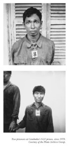
Given Daniel’s comments, it’s hard to imagine the Abu Ghraib photos ever ending up at the Met. MAN’s discussion of Abu Ghraib is worth noting in relation to a controversial acquisition that did take place: the archive of photographs S21: The Khmer Rouge Killing Machine joining MoMA. The photographer, Nhem Ein, was hired by Pol Pot’s regime to document every person admitted to an extermination camp as part of the Cambodian genocide. The photographs subsequently came to the attention of the art world when they were exhibited at the 1997 Recontres de la photographiques d’Arles. Eventually a set of the photographs were acquired by the Museum of Modern Art. In his essay “Art in the Face of Radical Evil,” available for free on October’s website, Thierry de Duve grapples with what it means for art theory when artifacts such as the S21 images enter the aesthetic space of the museum and acquire the label “art.” He rightly brings Avedon’s formally similar portraits into the discussion, and finally concludes,

Calling the photos by the name of art, baptizing them, in the second person—“You are art”—is just one way, the clumsiest, certainly, of making sure that the people in the photos are restored to their humanity; and this, not their so-called art status, is of course what matters. To speak of shouldering the role of the artist that Nhem Ein could not assume is another way of saying the same. There is nothing honorific to the name artist in this sense. If anything, it testifies to the impossibility of claiming to speak on behalf of all of us without speaking for the evil part of humankind as well as for the peaceful and civilized.

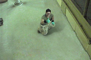
Josh Azzarella: Untitled #24 (Green gloves)

Josh Azzarella: Untitled #24 (Green gloves)

This comes back to the question of the archive and it’s role in the aesthetic sphere. Galassi makes it clear that MoMA is not an archive in the historical, rather than aesthetic, sense. But artists certainly make use of such archives as sources for their works. Josh Azzarella’s work is worthy of consideration in this regard, particularly addressing Green’s interest in a national processing of the legacy of the images. Azzarella’s intervention involves the erasure of the prisoners from the photographs. Their tortured, shamed bodies become conspicuous by their absence; the work functions in a strange way between formal analysis (seemingly inappropriate negative space) and mass media familiarity (our recognition and subsequent differentiation of the images). Azzarella’s Brechtian estrangement of the image allows us to see their horror once again.

Further reading:

William Vollman: Seeing Eye to Eye (Bookforum)

Steven Meisel and Kohei Yoshiyuki

February 28, 2009
Steven Meisel, from Dogging, V56

Steven Meisel, from Dogging, V56

This came out a while ago and has been posted about elsewhere, but Steven Meisel’s shoot “Dogging” in V56 is a boldfaced ripoff of Kohei Yoshiyuki’s seminal series, The Park. Yoshiyuki received a lot of press and attention over the past year and a half, with The Park exhibited at Yossi Milo Gallery and included in the Berlin Biennial and Gwangju Biennale in 2008.

Kohei Yoshiyuki, Untitled, 1971 from The Park

Kohei Yoshiyuki, Untitled, 1971 from The Park

There is a precarious line between drawing inspiration from another artist and simply copying their work. The Park was highly stylized to begin with, and Meisel turns it up another notch by infusing fantastic colors. It’s odd however that the editors (or Meisel) decided to cloak the series as an “original” commentary on current sexual mores among British youth, called “Dogging,” when in fact the source material was clandestine trysts — homo- and heterosexual — in 1970s Japan. Is this a process of Westernizing the content? It’s not exactly news that advertising and editorial content lift strategies from the “avant-garde” arts, but I wonder what was gained by Meisel’s shoot rather than running the original images. The shoot certainly doesn’t highlight the clothes, so what it is presenting is an lifestyle oriented. I’d be better convinced of the validity of the concept, except it doesn’t appear that Meisel has added anything, merely transporting Yoshiyuki’s form and edginess into a new context.

Mark Ruwedel: Westward the Course of Empire

February 28, 2009
Mark Ruwedel: Picacho and Colorado River #3, 2000

Mark Ruwedel: Picacho and Colorado River #3, 2000

Yossi Milo Gallery

Feburary 5 – March 14, 2009

Karen Rosenberg has a nice review of Mark Ruwedel’s exhibition Westward the Course of Empire, and successfully covers the historical and aesthetic context, but the exhibition raises a number of additional questions. Ruwedel re-traces railroad lines across the American West, photographing the deteriorating infrastructure. In many instances the lines are completely abandoned, recognizable only by the scars left by their grading or the splinters of the ties and trestles. Beautifully printed, Ruwedel (I believe) shoots 8×10” black and white film and contact prints, dry-mounting on 16×20″ mat board. The artist titles each work in pencil directly on the mount, describing the name of the railroad line, for example Canadian Pacific #3. Rosenberg makes all of the right references to the New Topographics (in particular Robert Adams) and Carleton Watkins and William Henry Jackson.

The press release says Ruwedel “acts as an archivist,” but this is not the most accurate term. “Archivist” usually describes someone who organizes an existing collection of materials, whereas Ruwedel is himself creating material—to use the term is to de-emphasize his authorial role. Partially this misuse of terminology may arise due to fashion, witness the outstanding exhibition last year at ICP, Archive Fever, curated by Okwui Enwezor. Rosenberg perpetuates this idea, writing, “The presentation tends toward the archival.” But the photographs are framed and hung on the walls, in a typological style, and the pencil titling is an affected throw-back rather than an earnest attempt at filing and labelling. I’ve read somewhere that the artist considers the landscape as a repository of histories. Is the landscape an archive, or do landscapes simply bare the traces of prior events? Ruwedel is in a sense a person who creates an archive; he is documenting a set of sites that highlight technologic and historic entropy. Is to document the same as to archive?

What Ruwedel is doing may be more accurately attributed to atavism, that is, a reversion to a previous photographic form (a term taken from George Baker, again). As Rebecca Solnit’s book River of Shadows elegantly makes clear, the history of photography and the history of the railroad are inextricably bound as contemporaneous modern technologies at the height of Enlightenment aspirations. But in the American West the relationship is even more explicit, with photographic luminaries like Watkins and Jackson frequently hired by the railroad companies (as well as government land surveys) to document their industrious advances. Some of the most pristine prints from this era survive in large bound portfolios supplied by the photographers to their corporate employers. Photography and railroad were twin pillars of the Manifest Destiny propelling westward development. Ruwedel pays lip service to this spirit – albeit ironically – in the title of the exhibition, and also explicitly in compositions that echo his 19th century predecessors. The artist very deliberately adopts the formal strategies of a previous age, highlighting a genetic connection between photographs.

Baker sees contemporary photography operating between the dialectics of abstraction and atavism. Extending Baker’s argument, Ruwedel clearly operates according the Barthesian this has been. There is a timeliness to such images of collapse, but from a certain liberal or neo-Marxist position such a reading might be inevitable regardless of the S&P 500 rating. Given the formal elegance of the images and their loaded aesthetic history, in as much as they suggest an “infinite return,” they are also an ode to entropy, and therefore point to the future as well as the past.

Japanese Whiskey Consumption is Down

February 22, 2009

santori_perrinpostIn order to give this post some relevance to the art world, I’ll mention that the dominant “rhetorical” flourish in Chelsea right now would have to be a gallows humor.

There’s an interesting article from the Grey Lady about the culture effects of the 1990s economic downturn in Japan (and by obvious extension, what could happen in the United States today). Here’s the lede:

As recession-wary Americans adapt to a new frugality, Japan offers a peek at how thrift can take lasting hold of a consumer society, to disastrous effect.

But my favorite part:

Sales of whiskey, the favorite drink among moneyed Tokyoites in the booming ’80s, have fallen to a fifth of their peak.

To someone who was about three years old when Tokyoites reached the apex of whiskey consumption, this mostly recalls Bill Murray’s half-hearted attempts as Santori spokesman in Lost in Translation. (By contrast my whiskey consumption is up by 950% since the 80s, with no decline in sight – I’m thinking of releasing bonds.) Japanese businessmen may have cut out their favorite vices cold turkey, but somehow I don’t think that will be the case here…

When Consumers Cut Back: A Lesson from Japan

Altermodern: It’s a Walk-Off

February 18, 2009

Yesterday I started reading the UK reviews of Altermodern, the new Tate Triennial curated by Nicholas Bourriaud. Bourriaud is best known for coining the term “relational aesthetics,” and Altermodern deliberately attempts to develop a similar catch-all label for contemporary production after Modernism and Post-Modernism. The exhibition website includes a Manifesto of the Altermodern and hilariously, a Mix Tape (quite nice actually). In the interest of melding content and form the website needs some more hyperlinks, but let’s not quibble just yet.

picture-11For obvious reasons I am skeptical of this desire to label and posture, etc. I find the book Relational Aesthetics to be a useful rubric for understanding forms of contemporary artistic production for the particular time period. Bourriaud’s follow-up, Post-Production, is more nebulous in it’s focus, and although it was intended as continuation of the previous book, it has never acquired the same influence. Altermodern is the crystallization of these concepts, an Uber-interconnectivity no longer simply applied to people but also to words, images, objects, ideas, ad infinitum. It’s also very difficult to come up with a rebuttal, as it is something of truism. The manifesto immediately brought to mind Okwui Enwezor’s Documenta 11, and conveniently Enwezor contributes a catalogue essay.

The British dailys’ art writers are always a hoot, and not in a good way, so I figured I’d do an overview. Immediately after deciding this, I saw that the Frieze editors had beat me to the punch. There was no way I was going to log 3,000 words on the subject, so instead I will refer you , dear readers, there directly. I recommend reading the entirety of Dan Fox’s post, but for Cliff Notes here are few hightlights:

Here’s how Campbell-Johnston saw fit to broach the Triennial’s theme in the Times: ‘So what will this new Altermodern era entail? Don’t expect the catalogue to help you. Bourriard is a Frenchman. He has svelte Gallic looks and a Left Bank aroma of Gauloises. And he seems to have been brought up on Baudrillard and Foucault in the way that the rest of us were brought up on our ABC.’ Does that really deserve to be called art criticism?…

After the laboured references to French cuisine, he went on to assert that ‘The weakness of Bourriaud’s theory — and of all French theory — is that there’s too much philosophy and not much historical perspective.’ I bow before Lewis’s encyclopedic knowledge of continental philosophy. All French theory? Really? I’d love to see him argue that down at La Sorbonne…

Januszczak’s article contains a comparison that is worthy of mention. At one point he describes Nathaniel Mellors’ Giantbum film as ‘seemingly interminable.’ He goes on to mention the work of Iranian artist Tala Madani, currently exhibiting in the Saatchi Gallery’s ‘Unveiled’ show, saying that her paintings display ‘such astonishing courage and punchiness, the Middle East could be a significant location’ for new developments in art. (In the context of art exhibited under the banner of being Iranian, the word ‘courage’ here has patronising Orientalist overtones, almost suggesting that Madani goes to her studio everyday in downtown Tehran hiding paintings under her burqa.) The print edition of Januszczak’s piece was illustrated with a large image from Mellors’ Giantbum and Madani’s painting Holy Light. What neither Januszczak nor the newspaper’s picture researchers evidently know is that Mellors and Madani are partners, and that they exchange ideas and opinions about each other’s work on a daily basis.

The fires have been stoked. Get ready for the glossies. It’s a Walk-Off.

Emily Jacir and the New York Times

February 13, 2009

Screen Cap, nytimes.com

Screen Cap, nytimes.com

Bizarre review in today’s New York Times by Ken Johnson of Emily Jacir’s exhibition at the Guggenheim. When Johnson decides he is against something, it sometimes seems to cloud his ability to actually see the art; as a result his reviews can be downright curmudgeonly.

Jacir seems to be constantly surrounded by controversy. This in no small part has to do with the geopolitical concerns surrounding her work, which generally takes the experience of living in Palestine as its jumping off point. (For an overview check out her Wikipedia page). A recent installation at SFMoMA made headlines around the blogosphere for its unusual wall text. And two weeks ago the Times published an interview with Jacir in which she refuses to answer questions and emits evident tension between interviewer and interviewee.

I have not seen the exhibition so I cannot really comment on the content or quality of Jacir’s work. But reading the review, I don’t get the sense that Ken Johnson really engaged the conceptual strategies Jacir puts in play. He alludes to their familiarity, but doesn’t throw out any references (some of Sophie Calle’s projects seem relevant), other than a strange plug for a John le Carré novel. Instead, Johnson gets caught up in the politics of Palestinian-Israeli conflict, questioning Jacir’s motives and truth claims. Whatever “truthiness” emerges, I’m guessing that where Jacir’s work may succeed is in how she organizes materials and information. Johnson alludes to “conventional devices of conceptualism and performance art” but doesn’t take the idea any farther.

The New York Times reviews more exhibitions than any other daily publication, so an “off” review on somewhat controversial subject matter is somewhat par for the course; they simply don’t get it right all the time. Where things get really screwy is when you view the accompanying slideshow. (Again, I haven’t seen the print version for comparison.) The first slide is a striking black and white portrait of Jacir in close-up. To put it bluntly, she is beautiful; it’s hard to imagine the Times leading a slide show of Richard Prince’s works the same way, especially in a multimedia piece acompanying a review, not a feature. So the slides begin by highlighting her status as an attractive (exotic) woman–hardly the best lead-in for an objective viewing of her work. This same slide is captioned by an excerpt from Johnson’s review, which is the standard way of captioning these slide shows. But by the third slide, the images no longer correspond to works on view at the Guggenheim, and by the fifth slide, the captions come not from Johnson’s review, but rather from a 2005 review by Roberta Smith of Jacir’s exhibition at Alexander and Bonin. Contrast the caption on the first slide, from Johnson’s review, with the caption on the sixth and last slide, by Smith:

Emily Jacir employs conventional devices of conceptualism and performance art to call attention to the plight of the Palestinian people. (Johnson)

Ms. Jacir’s deft extrapolation of the issues of identity from the specifics of experience, like her renewal and extension of what might be called classic Conceptual Art, is enormously impressive. (Smith)

As much as this highlights the differences in Smith’s and Johnson’s criticism, it also gives an interesting lens on this disconnect between the editors and the writers. The editors, designers, and photo editors probably decide on the visuals and multimedia features long before the critics submit their copy. Does it make sense to give a lot of visual space to an exhibition that receives a negative review? The entire slide show is apparently cobbled together from previously published material, but with no continuity. What we are left with is a strange amalgam that obscures rather than clarifies, and at worst misrepresents Jacir and her artwork.